PT-BR
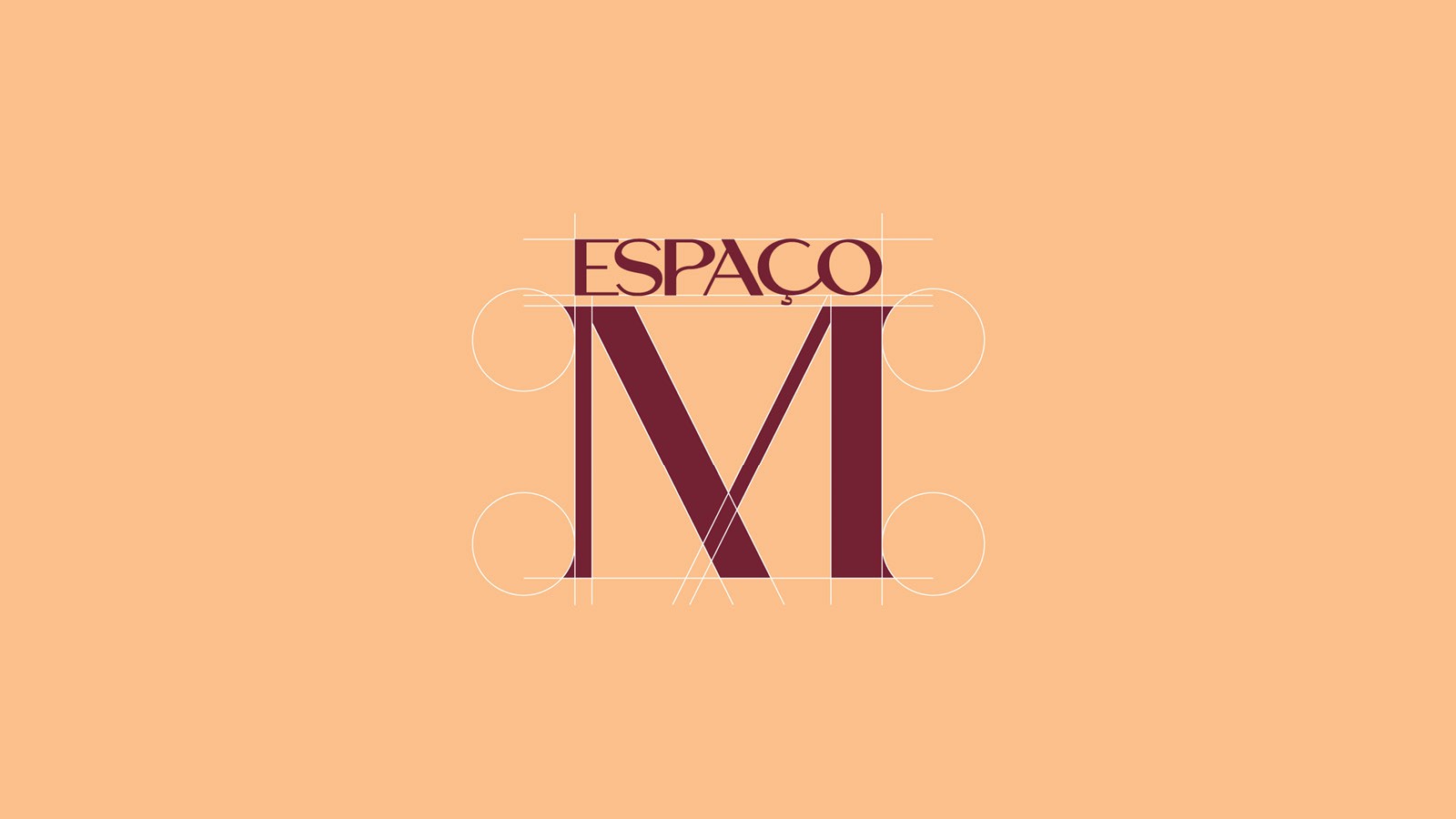
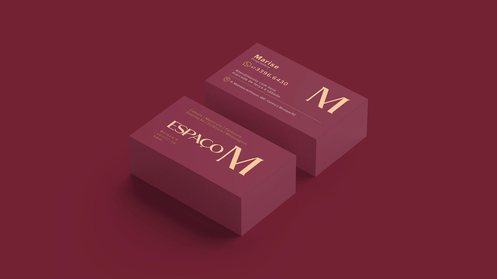
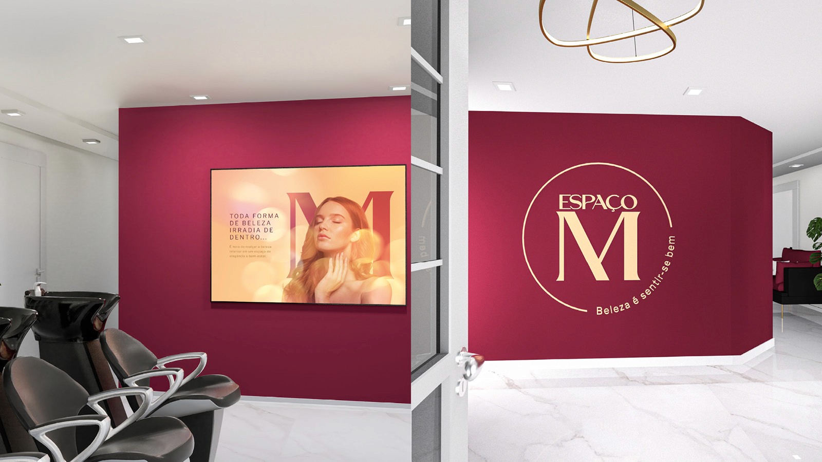
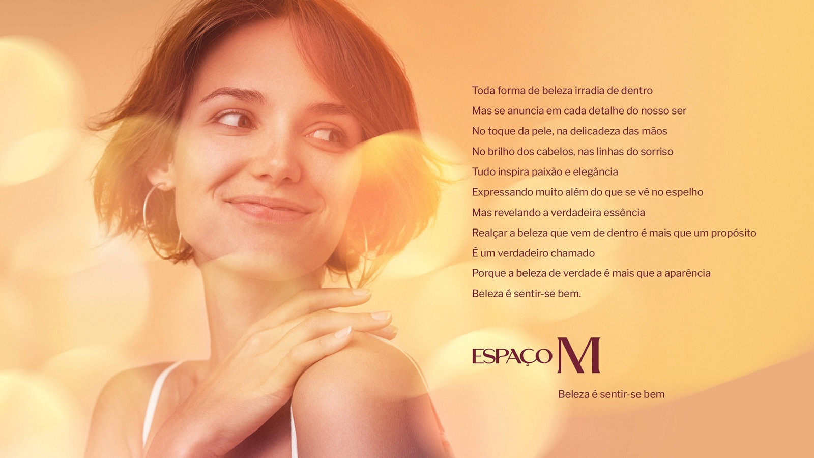
O Espaço M é um tradicional salão de beleza, reconhecido pela qualidade de seus serviços, especialmente em cabelo e mega hair, porém também oferecendo outras opções de serviços de beleza e estética. Neste projeto, tivemos o objetivo de redefinir a construção da marca, corrigindo seus problemas de comunicação, a começar pela grafia do nome. No conceito criativo, foi definida a letra M como ponto de partida para a construção de um símbolo memorável, harmonizando linhas de diferentes espessuras na tipografia para alcançar um padrão estético elegante. Essa composição é realçada por uma nova paleta de cores moderna e sofisticada, promovendo assim uma forte conexão da marca com o segmento de beleza.
EN
The Espaço M is a traditional beauty salon, widely recognized for the quality of its services, especially hair styling and hair extensions, also offering other options of services in cosmetic care. In this project, we had the objective of redefine the structure of the brand, correcting its communications issues, starting with the spelling of the name. The creative concept defined the letter M as the starting point for the development of a memorable symbol, harmonizing different line weights in its typography, achieving and elegant visual standard. This composition is highlighted with a new, modern and sophisticated color palette, a strong connection between the brand and the beauty segment.